SwiftUI-Design-System-Pro
Design tokens, a theme engine and tested SwiftUI components for Apple platforms
License: MIT
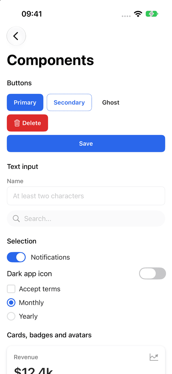
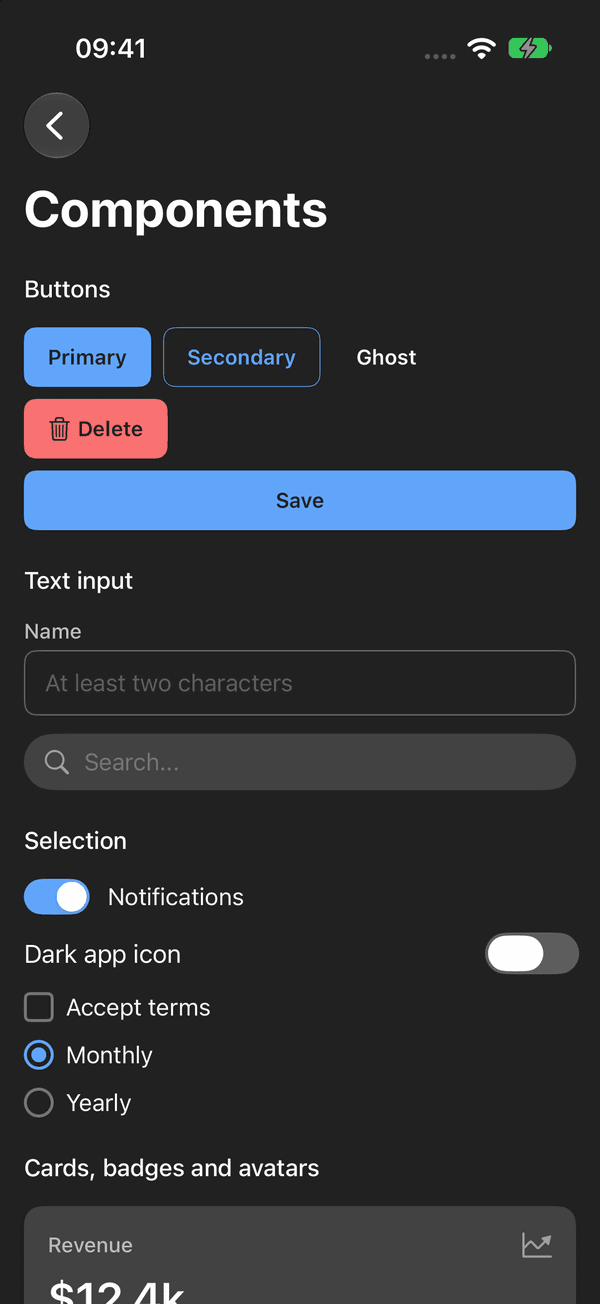
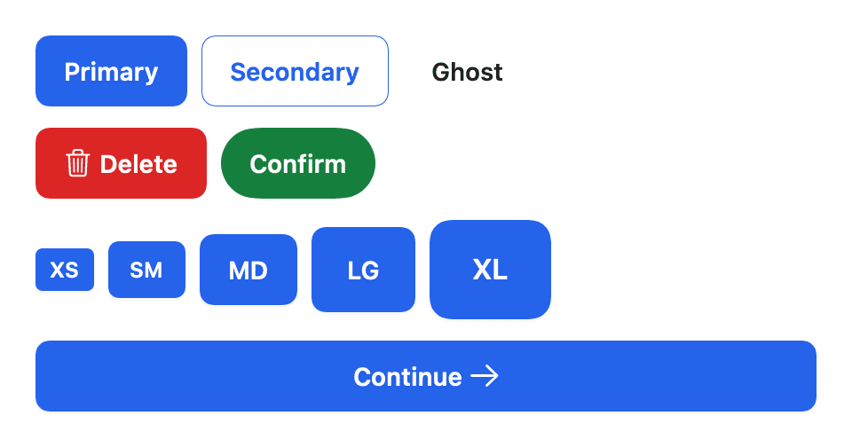
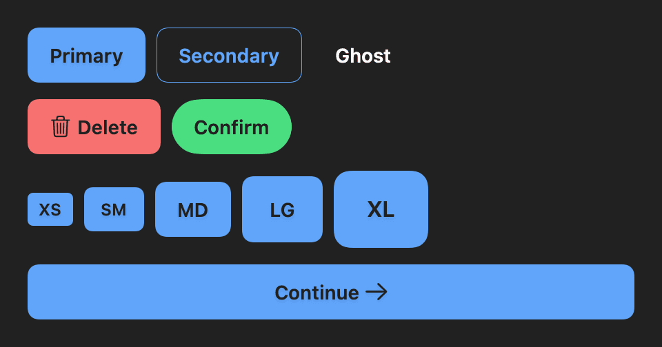
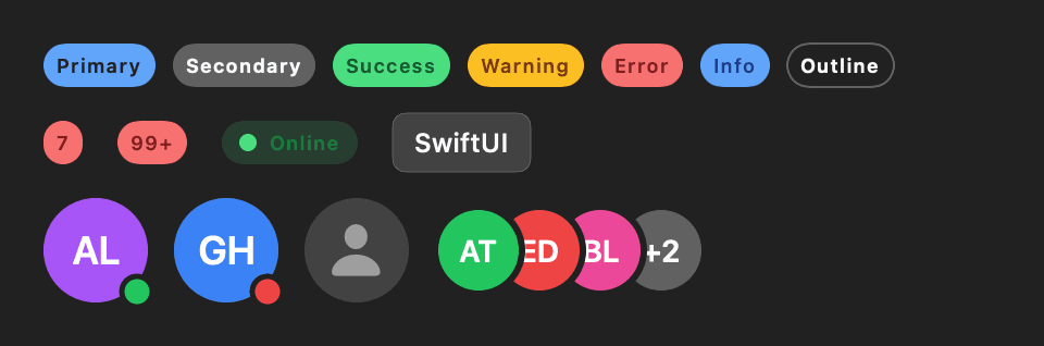
DesignSystemPro is a Swift package for SwiftUI apps that want one consistent look without building it from scratch. It has design tokens (colors, typography, spacing, borders, shadows, motion), a theme engine with light, dark, preset and brand themes, and about 40 component views built on the tokens. Every color token carries light, dark and high-contrast values, typography follows Dynamic Type, and a rendering test compares every component group in light and dark mode with stored reference fingerprints.
Features
- Two-layer color tokens: a primitive palette and semantic roles, each with light, dark and high-contrast values
- Typography tokens that scale with Dynamic Type through dsTypography(_:)
- ThemeManager follows the system or applies a preset or a theme generated from brand colors; your views read it with @Environment(\.dsTheme)
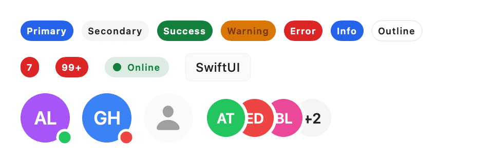
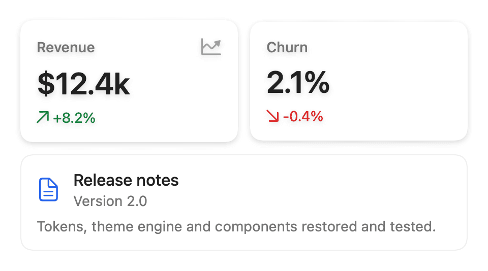
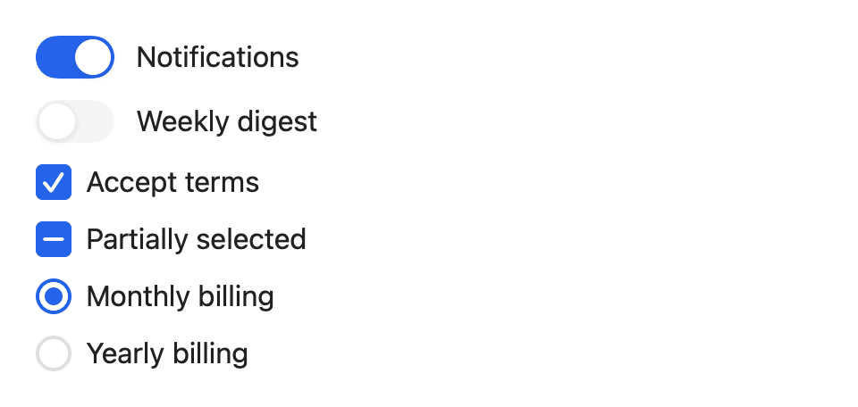
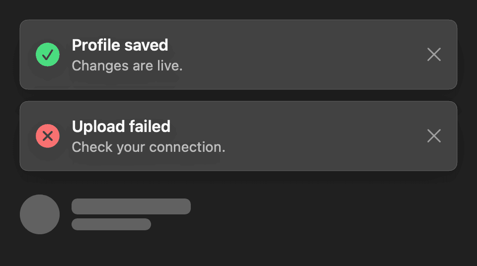
- Buttons, text fields (including search and OTP), toggles, checkboxes, radios, cards, badges, avatars, toasts and skeleton loaders
- ColorContrastUtility computes WCAG contrast ratios; tests check body text and filled-button labels against WCAG AA in both color schemes
- ThemeManager and DSToastManager are @MainActor @Observable classes with public initializers, so they can be injected and tested
- One package for iOS, macOS, tvOS, watchOS and visionOS with no runtime dependencies, built in Swift 6 language mode
Quickstart
1import DesignSystemPro2import SwiftUI3 4struct ContentView: View {5 @State private var notificationsOn = true6 7 var body: some View {8 VStack(spacing: SpacingTokens.Content.comfortable) {9 Text("Hello, DesignSystemPro")10 .dsTypography(TypographyTokens.Heading.h2)11 12 DSStatusBadge("Ready", variant: .success)13 14 DSToggle(isOn: $notificationsOn, label: "Notifications")15 16 DSButton("Continue", isFullWidth: true) {17 notificationsOn.toggle()18 }19 }20 .padding(SpacingTokens.Layout.screenEdge)21 }22}Installation
Swift Package Manager
1dependencies: [2 .package(url: "https://github.com/muhittincamdali/SwiftUI-Design-System-Pro.git", from: "2.0.0")3],4targets: [5 .target(name: "YourApp", dependencies: [6 .product(name: "DesignSystemPro", package: "SwiftUI-Design-System-Pro")7 ])8]Xcode
1https://github.com/muhittincamdali/SwiftUI-Design-System-Pro.gitScreenshots
Timeline
Repository opened with the first DSButton and DSCard views
1.0.0 tagged; the token, theme engine and component code that 2.0 is based on was written
A clean-up replaced most of the sources with placeholder files
Rebuilt as 2.0.0: tokens, theme engine and components restored, fixed and covered by Swift Testing suites